
Your post-click landing page design matters, because these pages are your digital storefronts — essential for promoting and selling your products and services. When optimized correctly, the pages can substantially increase conversion rates. Since they are critical for the overall success of your business, creating professional, high-converting post-click landing pages are integral to your marketing strategy.
Whether you’re looking for inspiration for your app post-click landing page, product post-click landing page, mobile post-click landing page, or something else. There’s a plethora of various post-click landing page design inspiration available.
At Instapage, we have an entire blog category dedicated to post-click landing page examples. We research and write on this topic frequently to provide our audience with inspiration from some of the world’s biggest brands. Including Microsoft, Lyft, Marketo, Constant Contact, Oracle, Facebook, MailChimp, and HubSpot.
In this article, we’re going to showcase some post-click landing pages, highlighting several different design techniques, to provide you with inspiration when creating your pages. For each example, we’ll discuss what the page does well, and what could be A/B tested to produce better results.
post-click landing page design inspiration
Compelling hero image
Humans typically process images up to 60,000 times faster than text. When used correctly on your page, images can compel visitors to engage with your page long enough to convert on your offer. It’s time to stop telling your visitors what they’ll get when they redeem your offer and start showing them instead. A hero shot helps the prospect to visualize what it would be like to experience the benefits of your offer.
TaskEasy understands this, and they make great use of a hero image on their page. As soon as visitors land on the page, they get a glimpse of what their lawn could look like if they hire TaskEasy:

What the page does well.
- The CTA button color stands out because it’s not used anywhere else on the page, aside from the Contact Us button.
- The CTA button copy uses first-person, which makes prospects feel personally connected to the offer.
- Directional cues (arrows on the CTA buttons and arrows pointing down the page) show visitors where they should focus their attention next.
- Iconography helps draw attention to the features and benefits of hiring TaskEasy.
- Trust signals and social proof (security badges, an award seal, and a Facebook like counter) likely make prospects feel comfortable, secure and even compelled to hire TaskEasy.
- The contact us slide out form allows visitors to easily contact the company to inquire about their services.
What to A/B test:
- The TaskEasy logo is hyperlinked which means visitors have an easy exit route off the page.
- The Property Manager CTA button at the top of the page takes visitors away from this page. Although it does open up another lead capture page, it should have its own campaign, completely separate from this one.
- Adding copy would help prospects better understand the benefits of working with TaskEasy. Currently, there is no copy on the page, which might make it difficult for visitors to get a good feel for the company and the offer.
- The footer navigation provides too many ways for visitors to escape the page without converting.
- The phone number could be click-to-call enabled, making it that much easier for visitors to contact TaskEasy, especially since the company encourages them to call with “Want to call us? We’re here!”
Bullet points
People often don’t want to read through endless text to find what they’re looking for. They’d rather quickly scan the page to find specific information — bulleted copy makes this possible. Bulleted copy (leveraging checkmarks, arrows, iconography, etc.) is effective because it allows visitors to scan the page quickly and find what they’re looking for.
This Yodle example uses bulleted copy (check marks) to highlight the benefits of their software. It stands out from the rest of the copy on the page with white space too:
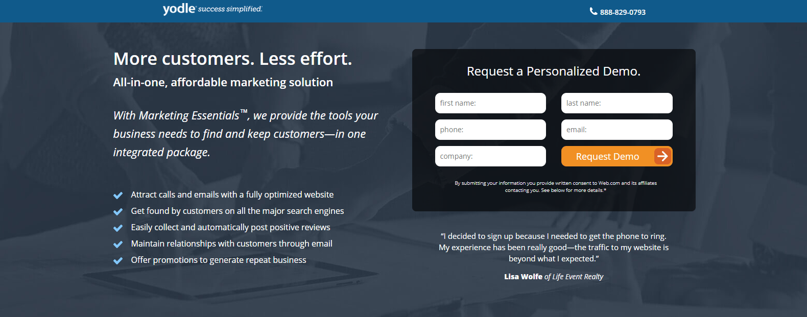
What the page does well.
- Yodle’s logo is not linked to their homepage, allowing visitors to see whose webpage they’re on without risking them clicking away from the page.
- The click-to-call phone number makes it easy for visitors to contact the company.
- The headline and subheadline inform visitors of what the offer is, and how it will benefit them.
- Italicized copy stands out from the rest of the copy, compelling visitors to read it.
- The encapsulated form is attention-grabbing, showing visitors where they need to go to request a demo.
- “Personalized Demo” makes prospects feel like the offer is specifically for them.
- The orange CTA button colorr “pops” on the page, drawing attention to it and increasing the chance that people will click.
- The arrow on the CTA button acts as a directional cue, piquing people’s interest in what’s behind the form.
- Trust signals (the customer testimonial, company logos, and award seals) increase the level of trust that prospects have for Yodle, which helps persuade visitors to fill out their personal information.
What to A/B tested:
- The CTA button copy isn’t personalized and may not convince many visitors to click. Changing it to something like, “I Want a Demo” or “Schedule My Demo” might generate better results.
- Including a headshot with the customer, testimonial would make it seem more personable, instilling even more trust in the prospect.
- The fine print in the footer could overwhelm prospects and deter them from converting.
F-Pattern
When designing your page, think of how your visitors are most likely to view your page. That way, you can place your most important elements accordingly. Since people tend to read top to bottom and left to right, designing your page to follow an F-Pattern is smart.
Oracle’s demo post-click landing page below follows a distinct F-Pattern layout. Each important element is located along the F-Pattern path where visitors are naturally going to look when viewing the page.
- Viewers will first spot the computer image in the top-left corner.
- Their eyes will then follow the horizontal stem and then see the people smiling.
- Moving down the left side of the page to the next horizontal stem, visitors will focus their attention on the headline and then over to the single form field.
- Next, they’ll continue the F-Pattern down the vertical stem, where they’ll scan the paragraph of text and the bullet points.
- Finally, their focus will end up on the bright red CTA button.

What the page does well.
- Smiling people make the page more humanized, which is likely to make visitors feel more comfortable.
- Bullet points and bold copy draw attention to the primary features of the offer.
- The 1-field form makes it quick and easy to complete.
- Visitors’ eye gaze is directed toward the form and CTA button, which implies that they should focus there and convert.
What to A/B test:
- The product image could be larger. Currently, it’s difficult to see anything on the screen.
- The headline isn’t persuasive because it doesn’t provide visitors with any information on how the offer will benefit them.
- The CTA button copy is weak. “Continue” doesn’t say anything about the offer and isn’t enticing to click.
- Including social proof, like a customer testimonial, could increase the credibility of the company and its offer.
- Footer navigation links might distract visitors, take them away from the page, and likely reduce the conversion rate.
Z-Pattern
Like the F-Pattern, the Z-Pattern also helps viewers navigate your page, making it another great layout option for your page design.
Here’s an example from Business-Software.com that follows a clear Z-Pattern.
- Visitors will first see the bold headline in the upper left corner.
- Moving along the top horizontal Z stem, they arrive at the red “Register to Download” stamp.
- Moving diagonally down and to the bottom left, viewers will focus their attention on the image of the report.
- Finally, they’ll complete the Z-Pattern with another horizontal stem, where they’ll end up on the most important element of the page — the CTA button.

What the page does well.
- The logo in the top-left is not linked so that visitors won’t be immediately distracted and taken away from the page.
- The headline and subheadline are effective in telling visitors that this report offers the top 10 marketing automation vendors and lets them know how they can benefit from downloading the report.
- Bullet points with minimal copy allow viewers to scan the page quickly and learn the key takeaways without having to read through much text.
- The word “free” is used in two places. On the red stamp, which is surrounded by white space and is very attention-grabbing, and in the copy, which is in bold formatting and right above the image.
- The report preview allows prospects to get a glimpse of what the report looks like, should they choose to download it.
- The yellow CTA button contrasts well with the rest of the page, likely making more visitors click it.
What to A/B test:
- The company logo in the bottom-right corner is hyperlinked to their homepage which provides visitors with a way off the page before converting on the offer.
- 13 form fields is a lot for an offer in the awareness stage of the marketing funnel. Asking for so much information this early in the buyer’s journey could easily deter people from converting.
- Increasing the white space around the most important elements. Such as the image and the CTA button would draw more attention to them and entice visitors to download the report.
- Adding social proof would likely convince more prospects to convert. As it would make them feel more comfortable and excited about the idea of working with Business-Software.com.
- The page footer could be removed. The small print seems unnecessary, and the company logo acts as an exit link, taking visitors away from this page.
White space
Another way to persuade visitors to focus their attention is to add white space. By including sufficient white space around certain elements, those elements stand out more on the page.
In addition to increasing the focus on specific elements, white space also helps.
- Reduce clutter
- Makes your page aesthetically pleasing
- Increase readability and comprehension
- Enhance the user experience
Take a look at all the white space surrounding the lead capture form in the MarcomCentral example below. Notice that the space around the form isn’t actually white. White space can be any color as long as it helps separate the different page elements and contrasts with the element that it’s highlighting. In this case, the form:
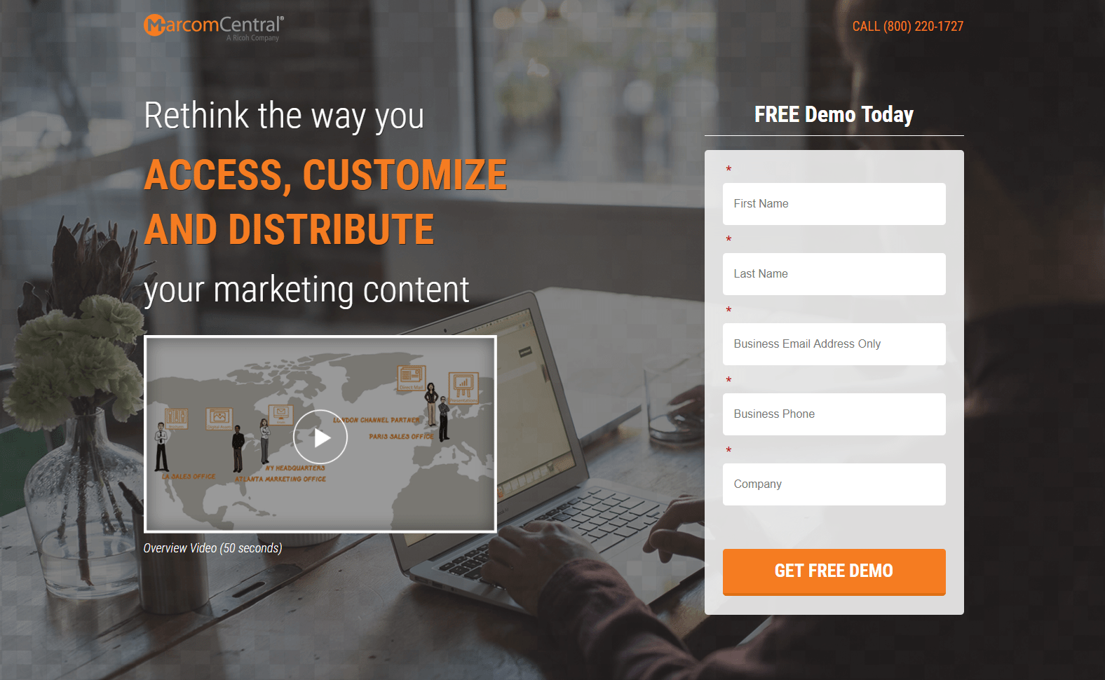
What the page does well.
- The click-to-call phone number provides visitors with a convenient way to contact customer service.
- The 50-second video allows prospects to quickly and easily obtain information without having to read through the copy.
- “Free” in the form title and first CTA button is highly persuasive copy since everybody loves free. Adding personalized copy could make this page even more persuasive.
- Anchor tags take visitors directly back up to the form when clicked, making it easier for them to find and complete it.
- Social proof instill trust and confidence in visitors. Including headshots with the customer testimonials would add even more value.
- The images in the “How it Works” section allow prospects to understand better and envision what each step is describing.
What to A/B test:
- The hyperlinked company logo has the potential to take visitors away from the page before they’ve even seen the entire offer.
- The headline should be changed because even though it’s large and stands out, it isn’t compelling. Because it doesn’t provide any benefits to the prospect.
- The orange CTA button doesn’t stand out as well as it could because orange is used multiple times throughout the page.
- The social media buttons at the bottom of the page could distract visitors and prevent them from converting.
Anchor tags
Anchor tags link to another location on the same page, allowing visitors to jump to a specific part of the page without having to scroll. Since anchor links take visitors where they want to go without much effort, they help improve the overall user experience, which aids in the conversion process.
PRWeb included two anchor tags on their page — both “Get Started Now!” CTA buttons below the fold. Which when clicked, send visitors back up to the lead capture form above the fold:
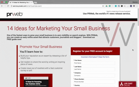
What the page does well:
- The headline is specific and uses second-person copy — two qualities that are great for persuading visitors to read further into the offer and eventually convert.
- Encapsulating the form makes it more attention-grabbing, which is likely to draw in prospects to complete it.
- Leaving the opt-in box on the form unchecked makes prospects feel like they are free to make their own decisions, rather than PRWeb making decisions for them.
- The images and formatted copy in the “How” and “Why” sections draw attention to the most important details regarding how PRWeb works and why prospects should choose PRWeb.
What to A/B test:
- Exit links (the company logo, social media buttons, and footer navigation) could all take people away from the page without converting.
- The bulleted copy could stand out more. Indenting it or enlarging the arrows would draw more attention to it.
- The image of the guide is cut off, which makes it look like a design error. It’s also clickable, but when the image opens, it’s still not the full image or any larger.
- 7-form fields might intimidate visitors and deter them from completing the form. Especially since they are likely still in the consideration stage of the buyer’s journey.
- The CTA button color (of all three buttons) doesn’t stand out because red and blue are used all over the page.
- The CTA button copy (again, on all three buttons) is vague. Something like, “I want the Marketing Guide!” is more compelling and would likely result in more clicks.
- The customer testimonial isn’t optimized. There is no headshot of Craig Kasnoff, no company name (and there shouldn’t be a comma after Media Consultant), and the testimonial itself doesn’t say anything specific to encourage prospects to work with the company as well.
GIFs
Incorporating media into your post-click landing page (in the form of images, video, or GIFs) can help increase conversions because they explain your product or service, while also making your page more visually appealing.
GIFs are animated images that help explain your offers more interactively. So rather than adding static images to your pages, like a screenshot of what your software dashboard looks like, add a GIF to visually demonstrate how prospects can perform different actions.
ActiveCampaign does this on their page:
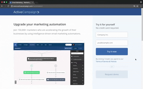
What the page does well.
- The headline and subheadline are compelling. The headline uses second-person copy, and the subheadline supplements the headline well, letting prospects know that over 150,000 other marketers use ActiveCampaign.
- “No credit card required” assures visitors that this offer is completely free.
- Only two form fields makes it likely that more prospects will complete the form.
- The customer testimonials are great for adding social proof, but the Twitter handles could take visitors away from the page without converting first.
- The scrolling form and CTA button increase the chances of visitors taking action because it’s visible no matter where they are on the page.
What to A/B test:
- The CTA button doesn’t stand out. The color blends in with the rest of the blue on the page, and the copy is unimpressive.
- The copy underneath the CTA button says “By clicking ‘Create’…” but the CTA button doesn’t say ‘Create.’
- Navigation links in the footer could easily distract visitors from the goal of the page.
Visual cues
Visual cues play a huge role in post-click landing page design. Because they help maintain a visual hierarchy, keep visitors engaged, and point them in the direction of essential elements. Three commonly used visual cues include arrows, eye gaze, and strategically placed objects, all pointing in the direction of elements that are integral to your conversion goal.
Arrows
Arrows are frequently used on post-click landing pages because they’re simple, straightforward, and easily understood. They can be animated or stationary, and are most commonly used to point visitors toward lead capture forms, and CTA buttons, like Bridgeline Digital does in this example:
![]()
What the page does well.
- Including a statistic about increased conversion rates is likely to pique visitors’ interest in marketing automation. Also, the bold formatting helps to draw attention to it.
- “Free” is mentioned in two different places, stressing that prospects don’t need to pay for this whitepaper.
- Bulleted copy makes it easy for prospects to find out what their whitepaper will contain, without having to read through blocks of text.
- The orange CTA button stands out and coordinates well with the form title and arrow.
- Company logos add trust value to the page, making visitors think, “If these well-known companies partnered with Bridgeline Digital, then I should too.”
What to A/B test:
- The hyperlinked company logo and footer links provide visitors with a way off the page, likely increasing the bounce rate.
- Increasing the white space around the product image would make it stand out more.
- The CTA button copy needs improving, as there is nothing persuasive about “Download Whitepaper.” Adding benefit-oriented and/or first-person copy would likely encourage more prospects to click.
Eye gaze
Since people have a tendency to look at what others are looking at, using human eye gaze as a directional cue is especially effective on post-click landing pages. For example, if a human image on your page is looking at the headline, your visitor’s attention is likely to be drawn to headline as well. Therefore, this technique is useful for making visitors look where you want them to.
On the page below, Vistage included an image of a woman looking in the direction of the lead capture form. When visitors look at her, they subconsciously feel compelled to look at the form:
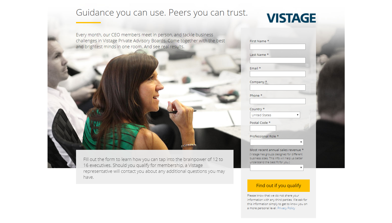
What the page does well:
- No exit links (aside from a privacy policy) makes it impossible for visitors to leave the page without clicking the “X” in their browser, or completing the form.
- Contrasting colors serve as a visual cue, drawing attention to the most important elements on the page: the headline, the woman, and the CTA button. Since the rest of the page is gray tones, these three components stand out above everything else.
- Including a privacy policy helps instill trust in visitors, letting them know that their information is safe and secure with the company.
What to A/B test:
- Adding social proof, such as customer testimonials or company badges, would likely entice more visitors to find out if they qualify for the offer.
- Minimal information about the offer might prevent people from converting. Adding bullet points or small chunks of text to highlight the offer benefits might produce better results.
Objects
A third commonly used visual cue technique is positioning objects so that they’re pointed directly toward a specific area of your page. Doing this focuses prospects’ attention on certain important page elements.
Lyft does this in the example below by positioning a vehicle directly toward – and almost touching – their lead capture form:

What the page does well:
- Only one form field is great for convincing people to hand over their information.
- Leaving the agreement checkbox unchecked makes prospects feel more in control and comfortable with the conversion process.
- The “See How Much You Can Make” section is useful because it allows prospects to enter their information and click the “Calculate” CTA button without leaving the page. After their weekly pay amount is calculated, the button turns into another “Apply Now” button, aiding in the conversion process.
- The “How Lyft Driving Works” section enables the company to provide step-by-step information about how Lyft works – and since it scrolls horizontally, it doesn’t clutter the page with copy.
What to A/B test:
- Several exit links make it easy for visitors to become distracted and navigate away from the page without converting on the offer.
- The headline and subheadline are difficult to read because of the busy background. Testing them in a different location where they are more visible might attract more attention and produce better results.
- The CTA button copy is as a vague as it gets. “Next” doesn’t say anything at all about the offer and likely doesn’t compel many people to click.
Visual hierarchy
Every post-click landing page should follow a specific visual hierarchy — content that’s organized from most important to least important. The element intended to first grab visitors’ attention (usually the headline) should be placed at the top of the page, as this is the top of the hierarchy, with the rest of the content then delivered from highest to lowest priority.
Many characteristics play a role in creating visual hierarchy, including but not limited to:
- Size
- Color/contrast
- Density/proximity
- White space
- Texture/style
SendGrid utilizes several of these components on their page. Let’s see which ones they use, and which ones they should consider improving:
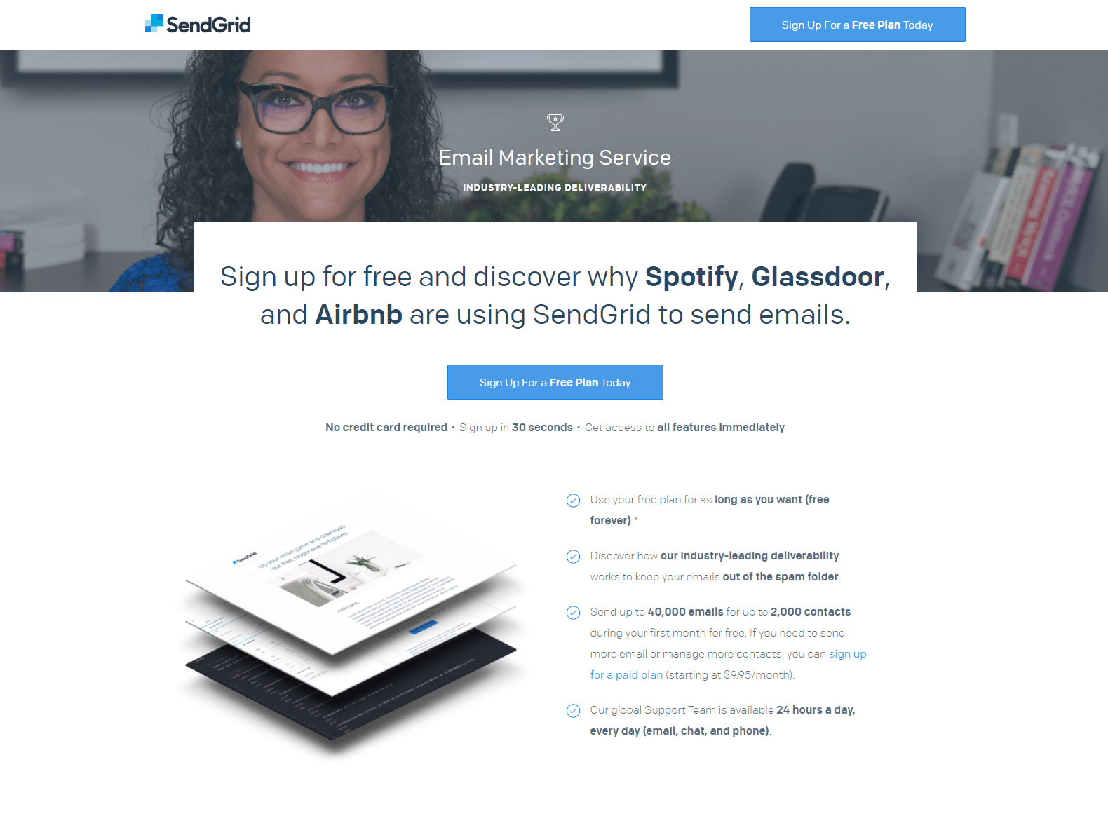
What the page does well.
- Size variation and bold formatting help draw attention to the most important bits of copy, forming a strong visual hierarchy.
- The headline compels visitors to use SendGrid by mentioning three big-name companies that are also using SendGrid.
- Multiple cooperative CTA buttons provide prospects with several opportunities to redeem the offer at different locations throughout the page.
- The product image shows a preview of what the delivered content will look like.
- Bullet points with minimal copy make it so prospects don’t have to read through paragraphs of text to find what they’re looking for.
- A customer testimonial and company badges serve as social proof, likely persuading more prospects to work with SendGrid, since others are finding success with them. Adding Dave Tomback’s headshot to his testimonial would make it even more effective.
What to A/B test:
- The woman in the image could be looking down at the headline/CTA button to add a visual cue and encourage visitors to look that way too.
- The CTA buttons could be enlarged and tested in a different color to draw more attention to them. There is blue elsewhere on the page, so they don’t “pop” as much as they could.
- Increasing white space around some elements, like the CTA buttons and the headline, would help them stand out more.
- The “See Plans and Pricing” CTA button should be removed because it takes visitors to another page, distracting them from this one.
Attention-grabbing CTA button
A perfectly optimized, attention-grabbing CTA button is the most important element to include in your post-click landing page framework. It should stand out above all of the other elements, so there is no confusion as to where prospects need to click to redeem your offer.
WalkMe created their two-step opt-in page with a large, contrasting CTA button that certainly stands out on the page, grabbing visitors’ attention:

What the page does well.
- The background image offers visitors a realistic preview of what their software will look like.
- The CTA button really pops on the page. In addition to it being large and contrasting, it also reappears across the top of the page as the user begins to scroll.
- The two-step opt-in form reduces clutter and makes users feel less intimidated, because they don’t have to enter their information here.
- Bulleted copy makes it easy for prospects to learn information about the offer without having to read through too much text.
- Social proof (the customer testimonial and the scrolling company logos) are likely to make prospects feel compelled to work with this company.
What to A/B test.
- Changing the CTA button copy to something more personalized (with first-person formatting) and benefit-oriented would likely improve the conversion rate.
- Replacing the image with a GIF (below the fold) would give users a more interactive experience on the page, and would help better explain the product.
- Adding a headshot to the customer testimonial would make it more trustworthy, increasing its effectiveness.
Which post-click landing page design techniques inspired you?
Using post-click landing pages to promote and sell your products and services is an integral part of your marketing strategy. That’s because when optimized correctly — with the techniques described above, along with our Design Best Practices Guide and post-click landing page Optimization Guide, they can substantially increase your conversion rates.
Turn ad clicks into conversions, create dedicated, fast-loading post-click pages for every offer. See how to provide all of your audiences with unique post-click landing pages by signing up for an Instapage Enterprise Demo today.

See the Instapage Enterprise Plan in Action.
Demo includes AdMap™, Personalization, AMP,
Global Blocks, heatmaps & more.
